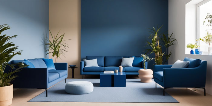
Blue Living: How Color Trends Are Redefining Modern Homes in Indonesia
In 2026, color trends in interior design are capturing attention not just for aesthetics but for the way they influence mood and lifestyle.

Among the most talked‑about hues this year is blue, a color that many designers and paint authorities have spotlighted as one of the most calming and influential shades for modern living spaces. While designers around the world explore bold palettes and emotional colors, Indonesian homeowners are increasingly drawn to blue for its psychological comfort and visual depth, blending contemporary style with everyday well‑being.
Color trend forecasts show that blues especially those with emotional resonance are emerging as favorites in 2026 palettes. From soft vintage blues like Patina Blue, which evokes a sense of lived history and calm, to deeper rhythmic hues designed to support emotional balance, this color is shaping the way designers and homeowners think about interior space. Below, Home – Business Yoast will explain further.
Why Blue Matters in Home Design This Year
Blue is far more than a decorative choice in 2026. It reflects a broader cultural shift toward spaces that feel nurturing and restorative. After years of rapid living and digital overload, many people seek environments that encourage relaxation, focus, and emotional resilience. Blues have long been associated with calmness and stability, linking visually to sky and water and triggering a soothing psychological response.
In Indonesia, this trend resonates with a growing interest in design that supports wellness. Blue tones whether used on walls, textiles, or accents are being integrated into homes to create a sense of tranquility and balance. Designers advise that blue can reduce visual stress and foster a serene atmosphere, especially in areas dedicated to rest, reflection, and family connection.
A Palette for Modern Lifestyles
This year’s trend does not rely on one single shade of blue but rather a spectrum. Slow Swing and Mellow Flow are part of a broader palette branded by paint experts as Rhythm of Blues™, offering both deep, contemplative tones and lighter, more energizing blues. These shades can be mixed or paired with warm neutrals to create layers of visual interest without overwhelming the space.
Another variation popular among international interior trend forecasts is Patina Blue, a vintage and tactile hue that feels both historic and fresh.
Baca Juga: Modern Choices, Shaping a Lifestyle That Truly Fits You
How Blue Enhances Different Spaces
Designers also suggest that blue pairs beautifully with other trending colors in 2026. This flexibility makes blue a core component in layered palettes that reflect both personal expression and functional harmony.
Creating Personal Sanctuary Zones
In Indonesian homes, where social and family life often plays out in shared spaces, blue is being used strategically in areas intended for relaxation and personal focus. Designers recommend incorporating blue in corners dedicated to reading, meditation, or even calm conversation. These subtle design choices help craft a home that feels like a sanctuary rather than just a showcase of style.
Textiles and accessories also play a role. Throw pillows, curtains, and rugs in various blue tones can add softness without overwhelming a room. When used thoughtfully, these elements amplify the calming effect of the color and harmonize with wood finishes and natural light.
The Psychology Behind the Color
Color psychology is an influential factor in the selection of shades for interior design. Blue is known to promote relaxation, reduce stress, and even enhance focus. Because of these effects, it’s ideal for spaces where mental balance matters most.
This emotional dimension is especially relevant in Indonesia, where concepts of harmony and holistic well‑being are culturally embedded. Blue’s association with water and sky also resonates with tropical environments, connecting interior spaces to natural surroundings.
How to Apply Blue in Interior Design
Applying blue effectively requires thoughtful coordination with light, texture, and function. Designers suggest starting with a base shade that matches the atmosphere you want to create.
Pairing blue with warm neutrals like cream or beige can soften its coolness and create inviting contrast. Incorporating organic materials such as wood or woven textiles further enhances the welcoming feel of the space. Designers also encourage experimenting with patterns and accent colors to add personality and avoid monotony.
